01. The Brief
02. Strategy
03. Digital
04. Submissions
05. Budgets
06. Project Management
07. Design
08. Writing
09. Illustration
10. Photography
11. Production
12. Benchmarking
13. Fact Sheets
About
Contact
02. Strategy
Publishing an Annual Report can be
a difficult journey, but having a strong core strategy is one way to keep all
the information to message, and that introduces a discipline to all aspects of
the report. It gives the report a beginning,
a middle and an end, and most readers will remember an interesting story rather
than a bunch of facts and figures.
Best
practice
Key points:
- Align the strategy to the reason for producing
the report
- When planning the contents, the structure should have a logical flow because building the story improves usability
- Navigation is the key to an accessible report
– it makes it easy for users to dip in and out of the report
- Most readers will remember more from an
interesting story than a bunch of facts and figures
- Showing is always better than telling. Design and photography can communicate your message better than just words.
Publishing an Annual Report can be a difficult journey, but having a strong core strategy is one way to keep all the information to message, and that introduces a discipline to all aspects of the report.
Why produce an Annual Report?
Compliance
Many areas of society, like government departments, listed companies and even some private companies, associations and not-for-profit entities, have to publish an Annual Report to comply with their rules of operation. This is part of acting in an open and transparent method and being accountable to others.
Archival purposes
Drawing a line in the sand once a year and documenting what you’ve done, how well (or not) you’ve done it and what you are planning for the next year ensures that your activities are documented for posterity.
Marketing
Marketing doesn’t have to mean ‘spin’. An annual document is a valuable tool to communicate your key message. Writing an Annual Report forces contributors to be succinct and write to a deadline. The final publication/website is a valuable marketing tool that can be included in submissions, used for orientation of new staff and as a lobbying document.
Online or in print, the structure of an Annual Report is critical.
Some organisations follow the same structure each year, and while it is easy to take the attitude of 'if it ain't broke then don't fix it', in a changing market place, the structure should be questioned each year to ensure the readers can easily access the information they want.
Successful ways to structure a report:
- to reflect the organisational structure. The report could be ordered along product lines, business units or by geographical location — all are good ways to reiterate how the organisation functions
- put the important stuff up front. This is where you can highlight critical messages that must be communicated. 'Up front' means the inside spread – the very first part of the report. It could take the form of a list of bullet points, or one sweeping statement, or a key photograph that summarises your year
- address important issues in the first 8 pages — in fact, assume many readers are not going to read the rest of the report. Some call this the ‘helicopter view’ or ‘elevator read’ – it just means that you need to get the big picture across quickly. Imagine that someone waiting at reception picks up your report and flicks through the first few pages whilst waiting for a meeting. The aim is that this person will be able to understand your message within these few minutes
- ensure the information flows logically. Start with the big picture and continue through to the detail (even further detail could be delivered online). Design can help tie seemingly disparate pieces of information together.
The structure of your report can be documented in a flat plan and distributed to all key decision makers so everyone is clear on the contents and the amount of space allocated to each section.
Download a sample of a flat plan fact sheet.
Navigation
Making the report easy to navigate
You’d never expect to find your way in a large shopping centre with no signage – likewise readers of an Annual Report need a signage system – navigation. As reports get more and more dense, readers need help to locate the information they want.
Remember that reports are not read like novels. Rather than starting at the beginning and reading each page until the end, most users of reports flick forward and back, dipping in and out of the report as key messages attract their attention.
The contents listing is the obvious start to good navigation but rather than just list the contents as line items, use it to highlight major achievements and links to where that story is within the report. An index is also a useful tool in a very dense report. An interesting contents listing will draw people deeper into the report.
Navigation can also be aided by:
- A good, logical, information flow with a beginning, a middle and an end
- Active, descriptive headlines to section starts
- Section headings that are located in the same place on each section start
- Colour coding the sections and/or numbering the sections.
A report with a good, logical sequence is easier to navigate than one without, so getting the navigation correct from the beginning makes perfect sense.
Identify
your message
Start with clear and simple ideas, and never forget your audience. What do you want shareholders to take away from your upcoming AGM? What key financial and compliance information do you need to provide? Where are you going?
Storytelling is key to the successful design of any report. Remember that reports are not read as novels, so some repetition may be necessary to strategically get your message across. Where one reader may read a section in detail, another may completely gloss over that section but read another.
Once inhouse contributors have written their sections of the report it is usual for someone to edit all the copy to ensure that it speaks in the same voice. That same person may ‘top and tail’ the information – that is write active headlines and pull quotes that summarise/highlight key information. This ensures that each page reiterates the strategy of the report.
Strategic writing introduces the key themes early in the report and then expands on them in later pages.
Using design and
photography strategically
Design and photography can be just page decoration but if you use them strategically it adds volumes to your words. Showing will always work better than telling – and that's where images work better than just words.
Use the cover to create interest and set the tone of your report. This becomes even more critical when it’s the only use of colour within the report. If you are using a cover image, choose one that starts the story you want the report to tell.

Emphasising key points
Don’t assume that the readers can identify the important parts of your report – show them what’s important by using:
-
pull quotes
- extensive captions alongside images
- active, descriptive headlines, and
- information boxes where key points can be summarised.
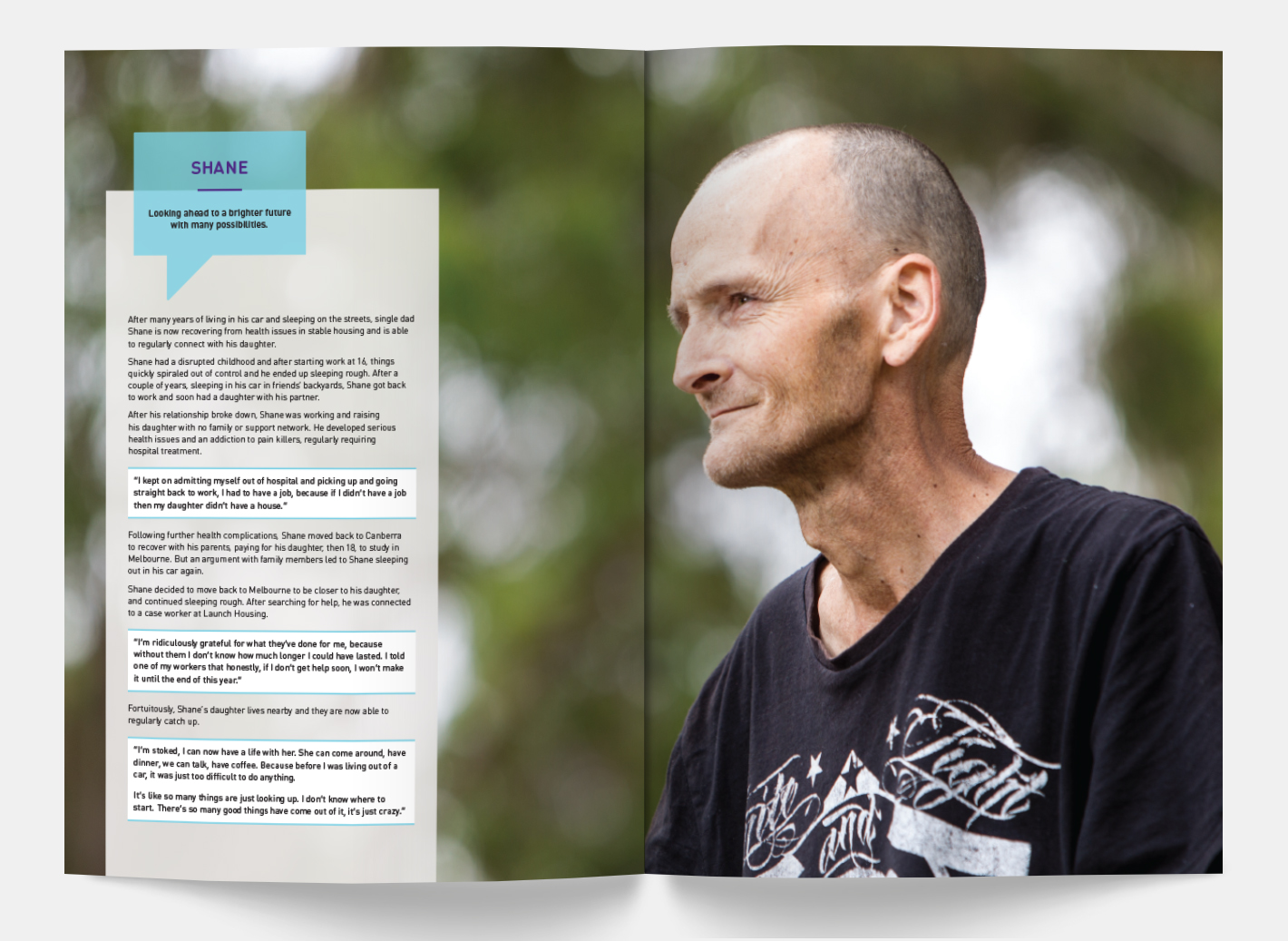
- choose photographs that tell a story, and remember sometimes the background is just as important as the subject.
One example is a portrait of someone in their work environment. Taking a wider shot of the person which shows more of the background may add heaps of information about how they work, where they work and who they work with.